

When we talk about using visual content in social media marketing, the conversation often turns to the best formats and tactics for direct response ads. It’s a shame, because visual social media has another superpower: helping tell a brand story so well it sticks with you.
When it comes down to it, certain brands have mastered the skill for telling their stories because they have harnessed the power of visual language and consistency–the resonance of each element with surrounding elements and with the overarching identity and voice of the brand for better social media strategy.
“Consistency” translates to honesty, clarity, and believability when viewed by the brand’s target audience, strengthening the bond between brand and buyer.
As marketers, that’s what we all strive for.
To help get you there, the social media team at Sculpt organized a Facebook Live to discuss four elements of visual content:
- typography
- color
- photography
- video
Each guest also shared one brand using an element well, and the science, numbers, and methods behind their success. Let’s break it down.
Typography
As Talya puts it, “Typography allows you to maximize the space of your visual media.” Copy doesn’t have to be restricted to the caption or post field; in fact, brands that use typography to tell a story are letting it spill into their images as well.
Who We Love: Magnolia
Magnolia, the multi-faceted home furnishings and lifestyle brand homesteaded in Waco, Texas (you may recognize its founders from the hit HGTV show Fixer Upper), is a perfect example of a brand using typographic images properly. For example, this pair of images advertising the opening of a pop-up store:
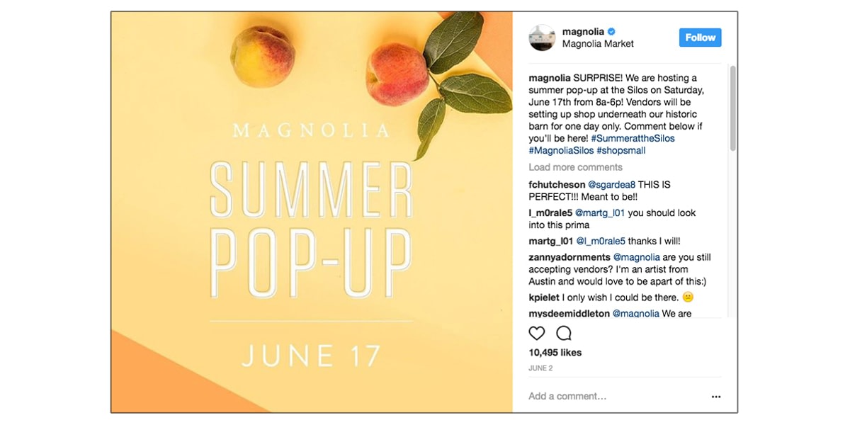
Why It Works
Typographically appealing images tend to adhere to certain aesthetic guidelines. First, a typographic message should convey its message easily–text should be clear, in a font that is easy to digest, in a color that stands out from the background, and in a size that doesn’t require squinting or zooming in. Choosing the right font often solves most or all of these rules, and certain fonts are actually more “believable” than others.
Only the most important information should be included, and information presented in the image should be arranged hierarchically. In the Magnolia images, the most important text, “Summer Pop-Up” catches the eye immediately, informing the viewer of the post’s topic and key message.
From there, the p’s in “Pop-Up” point downward toward the next-most important information: the date of the event. Finally, the brand name appears at the top–it’s both a frame for the main text and the “signature” of the brand persona.
Magnolia does this all well to create a clean, on-brand image. They’ve chosen a simple, thin-lined, sans serif font which reads well and in white “punches” out from the bright background. Font size organizes the information into clear, hierarchical roles, and the copy itself is short and easily digestible.
Notice they haven’t included the time or location of the event. Any other relevant information, including web address and store locations, can be found in the accompanying caption copy.
Color
Color can be one of the most powerful tools used to convey a brand story. Because of their strong link to emotion, hues can speak to a brand’s tone and style before words ever get a chance.
Brands that are able to maintain a consistent color scheme in their images tell an ongoing story; brands that intentionally use color to help viewers explore their brand tell an exciting one.
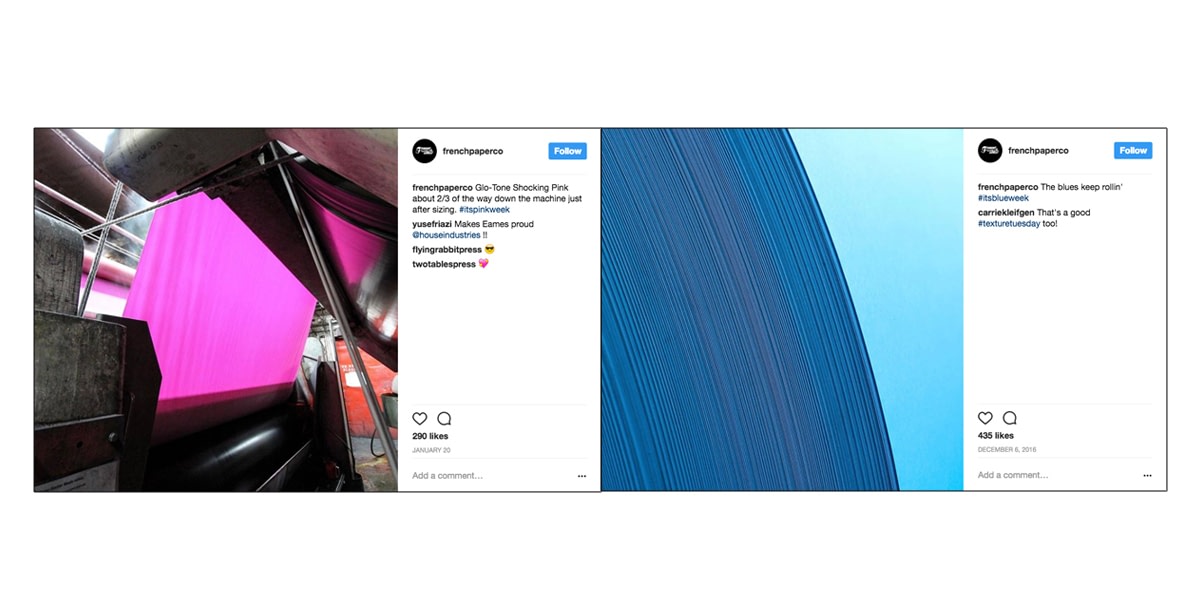
Who We Love: French Paper Co
French Paper Co., a Michigan-based paper mill, uses the natural, everyday beauty of its products to engage its viewers on Instagram. Don’t let the word natural fool you into thinking there isn’t a strategy to their use of color, however–each image resonates with those immediately surrounding it, creating a quilt of corresponding image blocks that encourage seamless scrolling and feature punchy images that catch (and hold) the eye.
Why It Works
There are enough color-theory infographics to fill this page twice-over; we won’t bore you with a chart of all the feelings commonly associated with colors–red is exciting and stimulating, black is luxurious and mysterious, etc.
However, it is important to understand how color affects the perception of a brand through the use of color in an image’s subject and scheme.
French Paper Co. does a great job of letting the color subject of its images tell a story. Nearly every image contrasts the industrial elements of the printing machinery with bold, candy-hued rolls and sheets of paper.
These consistently unexpected splashes of color speak to an element of quirk that, right on cue, shows up in their caption copy. The bold, color-blocked shots of the paper grab the viewer’s attention when scrolling, inviting click-through to the brand’s profile page.
The overall scheme of the images French Paper Co. includes on its feed affects the story: had the company chosen a more muted color scheme, or even gone so far as to only include black-and-white images, the tone of the brand persona would change drastically, from engaging industrial quirk to mysterious industrial mood. Even a monochrome color palette, say shades of blue, would limit the brand to the emotions associated with that singular color.

15 Best Social Media Tactics for B2B Lead Generation
Read this blog post next ➜Photography
Photographs are perhaps the most intuitively engaging form of visual media–they’re accessible to everyone; a universal language of its own. They’re also compatible with every social platform, so including them in a visual storytelling campaign is a no-brainer for a digital marketer–data shows that social posts including images garner consistently higher engagement metrics than text-only posts.
Brands that leverage the storytelling potential of photography understand the complex visual language behind an image, and highlight the elements that make an image “good”.
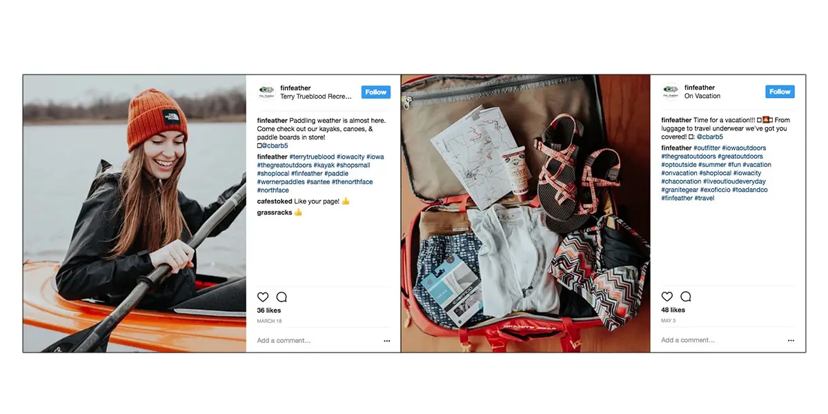
Who We Love: Fin and Feather
Fin and Feather, an outdoor retail brand based in Iowa City, exemplifies a well-run lifestyle photography strategy. Their Instagram images are consistent and clean, encouraging viewers to project themselves into the epic landscapes, tidy flatlays, and dynamic outdoor gear displayed on the account.
Why It Works
There are plenty of reasons an image is “good”–light, subject, context, to name a few–but a few stand out as surefire ways to create an impactful and (just as important) consistently on-brand image.
Fin and Feather’s photographs use a consistent filter: a blue-ish, natural light that shows products as they would appear when used and worn in the great outdoors. Even the flatlay photos are well-lit, authentic in their point-of-view perspective. Consistent coloring of light and subject matter contribute to a well-curated and cohesive brand aesthetic.
Fin and Feather images are easy for the eye to digest as well. In the kayak image, the eye immediately jumps to the model’s smile, then follows her gaze down the paddle. The whitespace of water behind her frames the subject and directs the viewer up and around to the top of her hat, balancing the photo’s horizontal and vertical motion.
To mimic Fin and Feather’s success, follow the rule of thirds when cropping and editing photos: divide the image into thirds horizontally and vertically, then align the subject and horizon with the top, bottom, right, and left guidelines so that the image’s movement flows from one section to the next.
Finally, Fin and Feather does a great job of styling its subjects so that images have a cohesive “vibe”–its models and subjects appear in complementary environments that resonate with the brand’s voice. You’ll never see a Fin and Feather model posed in an inner-city alley, for example, or an abandoned car lot. Non-human subjects, like suitcases or climbing gear, are displayed on rugged or rustic surfaces, like a wooden deck or cabin floor.
Video
The last frontier of visual media, video has surpassed all others in terms of projected user growth and popularity on social sites. One study found that four times as many consumers would rather watch a video about a product than those who would read about it.
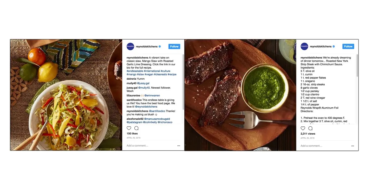
Who We Love: Reynolds
Reynolds, of kitchen staple Reynolds Wrap, has one of the most engaging Instagram feeds we’ve ever seen thanks to their creative use of motion and continuity.
Why It Works
Not only does the account include dynamic and colorful stop-motion videos of recipes made easier with their product, but the account itself is an “endless table” of images cropped to spill into each other, portraying an infinite tablescape.
By scrolling, the viewer becomes the motion-maker, turning the entire account into an experience rather than a collection of like images.
You don’t have to commit to such an intensive strategy to make good use of motion on social media. Platforms like Instagram and Facebook offer “carousel” post types, where a single post can contain multiple images. Brands who use this well post like images together, building up to a call-to-action in the final image.
There are countless other ways to run a successful motion-based visual strategy–styles of video, from quick-time “Tasty”-style videos to stop-motion to Yeti’s immersive social miniseries. At any rate, video isn’t going anywhere, and smart brands will leverage its capabilities to build powerful stories.
Just remember: keep it consistent. 🙂