
The best place to get good social media content ideas is directly from the pros. That’s why we’ve put together some of the best posts, ads, and accounts we’ve seen in 2023.
Bookmark this page, get inspired and beef up your swipe file.
Don’t have a swipe file? We’ve got you covered. You can grab our free template here, or read our post about how to make your own. Like this post, it’s full of examples of B2C and B2B social media inspiration, so there’s something for everyone.
Here’s how we’re breaking up this post:
- Organic Social Media Content Examples.
- Paid Social Media Content Examples.
- Accounts to Follow for Content Ideas.
Alright, enough with the chit-chat – time to get inspired!
Organic Social Media Examples
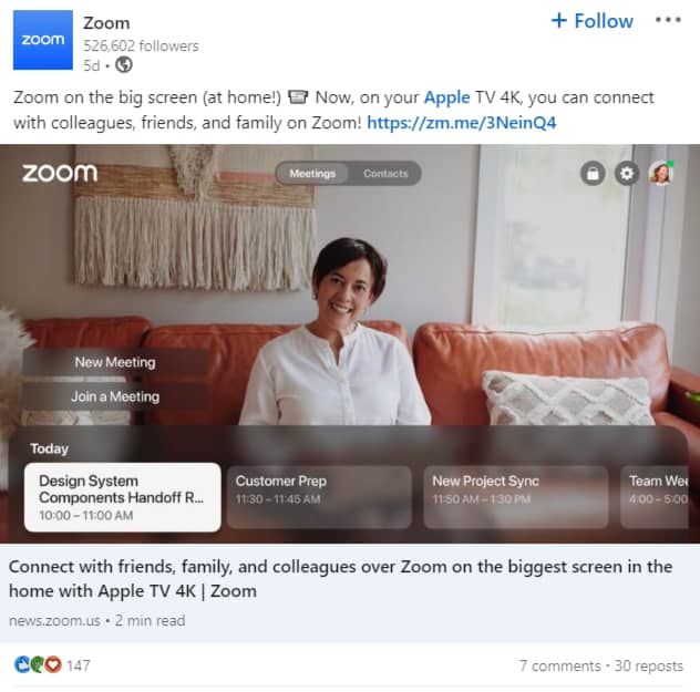
1. Zoom – Sharing Pro Tips for Users
Showcasing product features on social media is a great way to interest prospective customers and provide value to existing customers.
And yes, this is paramount for SaaS brands, as Zoom proves.
What we love about this post:
Concept: For a brand that provides collaborative/team communication solutions, Zoom knows the importance of pro tips for its users, as it’s a win-win for both parties. In this post, Zoom announces its new app for Apple TV 4K, which allows users to join Zoom Meetings from the biggest screen in their home.
Copy: “Zoom on the big screen (at home!) 📹 Now, on your Apple TV 4K, you can connect with colleagues, friends, and family on Zoom!” is all the copy needs to thrive. It spurs interest in the target audience and convinces them to click to see the new app for Apple TV. It’s great.
Content: Zoom cleverly knows that high-level meetings often use big monitors and that sometimes, quality is lost in these. With the new app, however, users can now leverage their big-screen, high-definition TVs in their Zoom calls. The result? A better product experience for their most valuable audiences.

How to Create a B2B Social Media Strategy: The Blueprint
Read this blog post next ➜2. HubSpot – Timely, Relatable Content
HubSpot never misses. In this post, they leverage several content marketing practices that we can’t help but admire.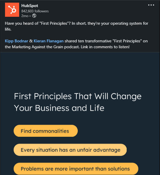 What we love about this post:
Creative: HubSpot came in with a captivating rage, which sure worked on most of its audience. Questions are always catchy, and matching a compelling caption with resourceful graphics is powerful.
Copy: The copy is all shades of “personal” and “points”. Copy that emphasizes what readers gain tends to be more successful. The post categorically mentions the reader’s life and business and gives relatable points in a visually compelling way. Starting with a captivating question and ending with an engaging one, the copy asks the audience about their take and what applies to them. This puts the reader in engagement mode – one of the ultimate goals of the copy.
Content: The post didn’t target only the corporate field. It considers the reader’s personal life and seeks to grow their business almost equally. This shows that the brand understands the different needs of its audience, and condensates that knowledge into a single, digestable post.
What we love about this post:
Creative: HubSpot came in with a captivating rage, which sure worked on most of its audience. Questions are always catchy, and matching a compelling caption with resourceful graphics is powerful.
Copy: The copy is all shades of “personal” and “points”. Copy that emphasizes what readers gain tends to be more successful. The post categorically mentions the reader’s life and business and gives relatable points in a visually compelling way. Starting with a captivating question and ending with an engaging one, the copy asks the audience about their take and what applies to them. This puts the reader in engagement mode – one of the ultimate goals of the copy.
Content: The post didn’t target only the corporate field. It considers the reader’s personal life and seeks to grow their business almost equally. This shows that the brand understands the different needs of its audience, and condensates that knowledge into a single, digestable post.
3. Shopify – Promoting Existing Assets
There’s a resonating engagement with services that leverage existing assets. Shopify’s content strategy is full of surprises, and the audience loves this. Creative: Shopify is leveraging existing assets – in this case, Shopify Credit – to boost the satisfaction of its audience.
Copy: Shopify addresses a key audience pain points (zero interest credit + cashback) in a simple, no-frills, manner. The copy doesn’t fiddle around and goes straight for the jugular, showing Shopify’s understanding of its audience’s needs.
Content: This post is a classic LinkedIn carousel. The content follows a standard structure, covering the definition (what), reasons why, and benefits of adopting Shopify Credit while providing a link for more detailed information. Flawless victory!
Creative: Shopify is leveraging existing assets – in this case, Shopify Credit – to boost the satisfaction of its audience.
Copy: Shopify addresses a key audience pain points (zero interest credit + cashback) in a simple, no-frills, manner. The copy doesn’t fiddle around and goes straight for the jugular, showing Shopify’s understanding of its audience’s needs.
Content: This post is a classic LinkedIn carousel. The content follows a standard structure, covering the definition (what), reasons why, and benefits of adopting Shopify Credit while providing a link for more detailed information. Flawless victory!
4. Taboola – Putting a New Spin on Slideshow Videos
Taboola takes a different approach to resound its efficiency to its audience. Picking on a product, the public advertising giant reminds us of the power of no-sound video ads. What we love about the post: Creative: Video ads are popular in the social media strategy space. Especially suitable for its “Do Not Disturb” audience, you don’t need to use the volume key to scoop the content of this post. With compelling graphics, mouth-watering images, and a sprinkle of social proof, Taboola walks the walk. Copy: The text and video-based copy call attention to the platform’s strength. It unanimously informs the audience of what they stand to gain by leveraging Taboola. The team leverages social proof by using figures, which may switch on the interest button of potential users. Content: The post comes in with a season, and that’s pretty much relatable. It further holds the reader’s interest with a clear, no-sound video showing the product’s impressive performance on their network.5. Hootsuite – Finding Creative Ways to Engage
Social media posts can be as much fun as educating. Hootsuite creatively relates this while marketing itself. We tried not to laugh too hard and couldn’t help but notice the strategic moves in this post. What we love about it:
Creative: This post is nothing short of creative communication. It teaches the audience tips on the job and the common mistakes to avoid.
Copy: Using a captivating introduction, the post steals the attention of HR professionals. Communication is critical, and we don’t have to wait for the pros to handle the basics. We love how the post singles out errors without necessarily making a mess of the slides.
What we love about it:
Creative: This post is nothing short of creative communication. It teaches the audience tips on the job and the common mistakes to avoid.
Copy: Using a captivating introduction, the post steals the attention of HR professionals. Communication is critical, and we don’t have to wait for the pros to handle the basics. We love how the post singles out errors without necessarily making a mess of the slides.
6. Shipt – Team Member Spotlight
The human angle will always matter in social media strategy. Shipt understands this and leverages humans as recipients and facilitators of its services. Here is what we love about the post: Creative: Using just two frames tells the simplicity of this post. Humanity resonates with it, as evident in the text and graphics. Copy: The text welcomes us into what Shipt is doing to improve humanity in partnership with the government. It goes further to show its moves in an easy-to-follow illustration. Content: The post banks on the conference to announce a part of its multidimensional service to shoppers. In doing this, the message scores two points – calls attention to Shipt’s Corporate Social Responsibility and boosts brand reputation.7. HubSpot – Employee Takeover
We love strategies that create space for humanity. HubSpot lets us know it’s not (always) about conversions and monetary gains but also human growth and development. What we love about the post: Copy: The copy is straightforward, and communicates HubSpot’s investment in its Engineering team. Content: We can say HubSpot knows the attention-grabbing game too well. Leveraging the “question intro” again, this post’s content steals the audience’s attention. This is a people-focused post, and we love that it has a male and female figure, just enough to tell a workplace vibe.8. Gary Vee – Using Image Text to Drive Traffic
Gary tells us image text can be a captivating communication strategy. But this particular post is not ordinary. We singled out its uniqueness and all its shades of engagement.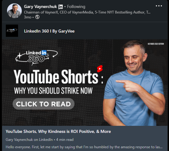 Creative: Image-text posts are unique in their way. The post uses a human image and a call to action that prompts the audience to read. Every key message is accessible at a glance with a straightforward pathway to the video resource.
Copy: The copy stands simple and direct. It doesn’t use any extra compelling words. Instead, it leads the reader to take action. We find it interesting that the human figure and text all direct the audience to take action.
Creative: Image-text posts are unique in their way. The post uses a human image and a call to action that prompts the audience to read. Every key message is accessible at a glance with a straightforward pathway to the video resource.
Copy: The copy stands simple and direct. It doesn’t use any extra compelling words. Instead, it leads the reader to take action. We find it interesting that the human figure and text all direct the audience to take action.
9. Amgen Oncology – Engaging the Audience with Quizzes
Amgen takes the audience on an awareness journey by bringing them into an interactive world of self-health. What we love about this post: Copy: it’s interesting that the copy won the audience’s attention with a question and retained it with easy-to-follow graphics. The color code is fantastic, and the slides combine as many basics of Leukemia as possible. Content: An unaware audience gets a basic understanding of what Leukemia is. The post further spirals the reader into another stage of the awareness test, with a constant reminder of the celebration being WLD22 #BELEUKEMIAAWAERE.10. BGCI – Leveraging User-Generated Content
Want to learn how to weave a hashtag into your content calendar? Botanic Gardens Conservation International is PRO at it. We find inspiration in the straightforward copy.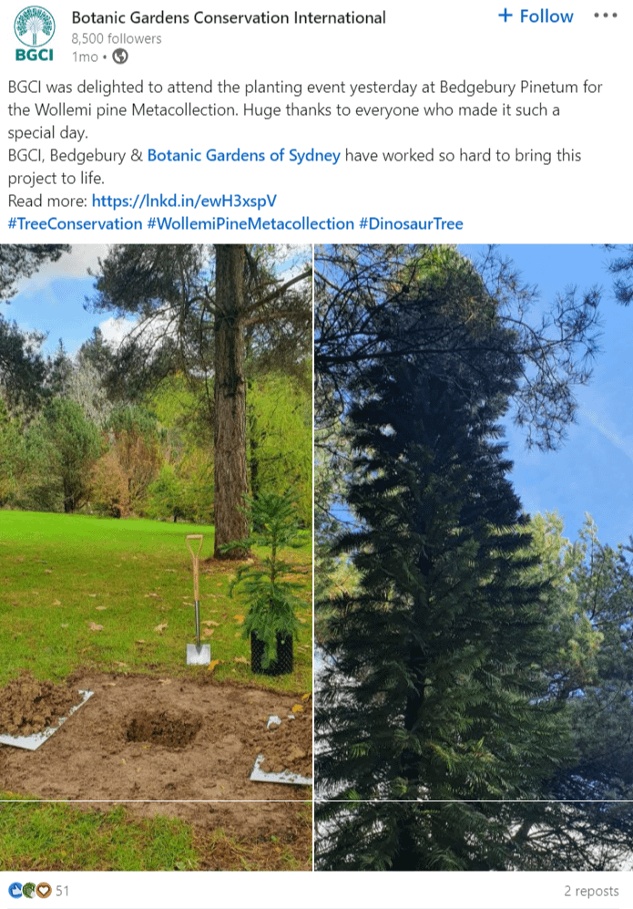 Here is what we like about the post:
Creative: You’d think it’s nothing out of the ordinary, and you wouldn’t be wrong. However, it keeps true to the company’s mission and showcases it in a simple, approachable manner..
Copy: We love how the copy didn’t take much space, raking the audience through what matters: Conservation and community-building efforts.
Here is what we like about the post:
Creative: You’d think it’s nothing out of the ordinary, and you wouldn’t be wrong. However, it keeps true to the company’s mission and showcases it in a simple, approachable manner..
Copy: We love how the copy didn’t take much space, raking the audience through what matters: Conservation and community-building efforts.
11. RoboKiller – Relatable Humor
Spam-blocking champion RoboKiller has mastered the use of relatable humor to pass messages across. The post below shows how they can nail relatable humor and creator collaboration.@spaceskits Need this Robot in my life 😭 Fool the scammers and stop the spam calls with @RoboKiller #RobocallRevenge #Robokiller #ad ♬ original sound - Cliff Benfield
What we love about this post:
Concept: The “fool the scammer” message was effectively and humorously passed. It employed a relatable storyline and delivered the promotional message creatively.
Copy: The copy is the most relatable part of the entire post. It uses a common scammer narrative and twists it to let people know that with a particular app, they can fool the scammer. Brilliant, humorous copy! Get the scammers to pee in the pool. Now, who’s the fool?
Creative: The video is easy and fun to watch as it keeps one glued within the first few seconds. Who says a good, humorous cartoon cannot serve an advertisement purpose? RoboKiller proves the haters wrong..
Caption: The caption gave an excellent finishing blow to whatever doubts aviewer may have concerning the content. It rounds up the advertisement post with a CTA that lets prospects know why they need the RoboKiller app.
12. Canva – Reinvigorating Media Coverage
Canva will snatch an opportunity when they see one. This post shows us all about it, and we love to see it!
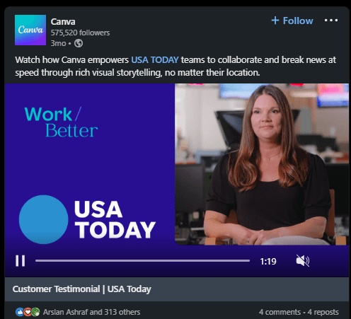
What we like about this post:
Creative: This video shows the benefits of using Canva and how it has helped USA Today journalists boost and simplify their work processes. It employs storytelling, visual appeal, and color to keep viewers interested.
Content: Rich storytelling makes this post shine. It directly states that Canva is one of the reasons why a newsroom works seamlessly. It doesn’t directly market itself – instead, it repurposes media coverage to deliver.

13. Taco Bell – Jumping on Silly Trends
Trends are like the sugar in the tea of social media marketing. Trust Taco Bell to leverage these trends whenever the opportunity arises.
@spaceskits Need this Robot in my life 😭 Fool the scammers and stop the spam calls with @RoboKiller #RobocallRevenge #Robokiller #ad ♬ original sound - Cliff Benfield
What we love about this post:
Creative: Trends can be a double-edged sword, but Taco Bell certainly got it right with this one. It captures life activities for the everyday man, from the monotonous ones to the celebratory ones, and then hints at what including tacos in your daily activities for 30 days can look like with the taco lovers pass. Relatable, human, and emotional.
Content: By promoting the tacos challenge and making viewers see themselves eating tacos for days, the brand gets all taco lovers on board.
14. Dave Gerhardt Marketing Group – Repurposing Podcast Content
You know we’re fans of making your content work smarter, not harder. For example, repurposing and reposting podcast content is a great way to fill out your content calendar with fresh, new content.
Dave Gerhardt does that with his marketing podcast.
What we love about this post:
- Creative: Audiograms are a pretty popular way to repurpose podcast content, but they’re often not very visually engaging. Gerhardt gets around that by adding a few simple elements: the cutout of his face, the lightly animated elements, and the subtitles for watching in “stealth mode”. Together, these elements grab and hold the viewers’ attention in a way that just the audio waveform in the background couldn’t do on its own.
15. Sculpt – Distilling Large Ideas for Social
People listen to their friends, colleagues, and community members when making sales decisions. Here at Sculpt, we understand that and pass the message effectively in this simple yet colorful post.
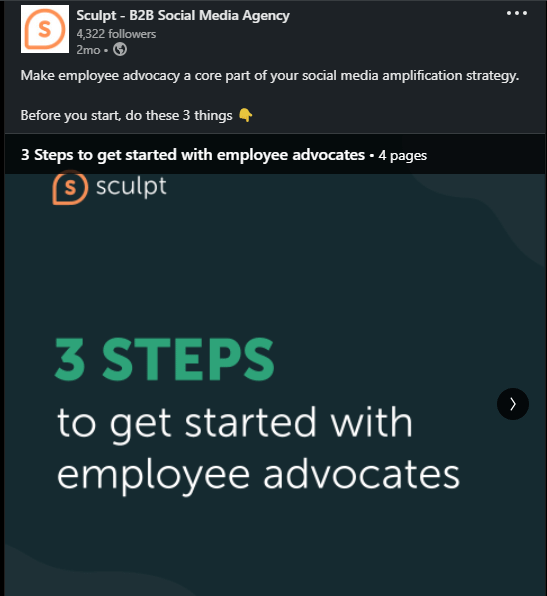
What did we do well in this post?
Copy: The copy is adventurous, and we love that it seeks to onboard organizations or CEOs who haven’t considered Employee advocacy.
Content: Not giving all there is, the content shows authority without much talk. Engaging and converting content is typically sharp, multidimensional, and people-focused. This post provides additional communication with infographics, and this helped to understand the message better.
Creative: The post approaches the issue from a compelling angle. Since there is no exact industry, brand, or company type that cannot leverage employee advocacy, the post is readable and communicative.
16. MoxiWorks – Savvy Image Text Placement
Mixing text and images is no extreme sport, but if your image-text placement is conflicting (or just not easy on the eyes), it can ruin your intentions.
Real estate tech platform MoxiWorks uses image and text placement in a straightforward and relaxed way.
What we love about this post:
Creative: Simplicity works. Meanwhile, knowing how to slay it is equally critical. MoxiWorks did justice to this creative approach by using one image, a great call-to-action, and a short selection of colors.
Copy: It’s what a copy should be. Precise, straight to the point, and spurring action. In seven words, the copy lets the post viewers know that with MoxiWorks, you can get more customers and sell more homes as a real estate agent. Perfecto!
Save Your Inspiration with a Swipe File!
Use our swipe file template to save social media examples and ideas.
Paid Social Media Examples
17. Moz – Standing Out with Colorful Ad Creative
We mentioned using bright colors to stand out in your audience’s feed in the earlier section on organic social. The same holds true for paid media.
Moz does an excellent job of grabbing attention with bold color choices.

What this ad does well:
- Creative: The color palette is bold, but not so bright that it hurts the eyes or distracts from the message. The lines and graphical elements draw the eye into the center of the image, where there’s a human face.
- Copy: Strong, minimal copy studded with impressive, curiosity-raising stats gets the point across quickly and efficiently.
Clever targeting: This ad is targeted to people who like marketing and marketing agencies, so a case study link makes sense.
- Airtable – Bringing Creative Flair to Ads
You’re more likely to reach prospects with paid social, so channel some of that creative energy (usually reserved for organic social posts) into your ads instead to hit your social media KPIs.
Airtable is a great example of a company that builds beautiful ads but doesn’t spend a lot of time on its organic presence – and that’s ok.
How to Create a B2B Social Media Strategy: The Blueprint
Read this blog post next ➜What we like about this ad:
- Creative: The illustrations combine an eye-catching style with funny captions to grab and hold attention in the feed. This same illustration style is present on the Instagram account, creating a cohesive, branded look.
- Copy: Ad copy doesn’t have to be dry and boring. Airtable illustrates that with a short, witty copy that delivers an effective value prop.
- Landing page: The idea of using your Instagram account as a landing page is both unique and aesthetically pleasing. It’s also a great move for brands that haven’t developed a consistent organic strategy but are starting to run ads.
19. Adwerx – Savvy Image Text Placement
Ad copy is definitely important but ad image copy is even more so. Check out how Adwerx uses image text to maximum advantage in this example:

What we like about this ad:
- Creative: Clean, seamless design. It pops against the white of the feed and draws the eye from the feed into the middle of the image.
- Copy: This ad recognizes that the image comes first, not the primary text. That’s why the main, impressive stat is introduced in the image text and then readdressed in the primary text.
20. Homesick Candles – Aesthetically Pleasing Video
Don’t underestimate the power of clean aesthetics. Homesick Candles consistently nails that in their ads.

Watch the whole ad here to feel a little homesick.
What we like about this ad:
- Creative: The direct messaging text and subtle cinematography of a flickering candle flame make for a minimalist but aesthetically pleasing ad. It’s also a great example of a simple way to reuse and refresh product shots for your Shop Now ads.
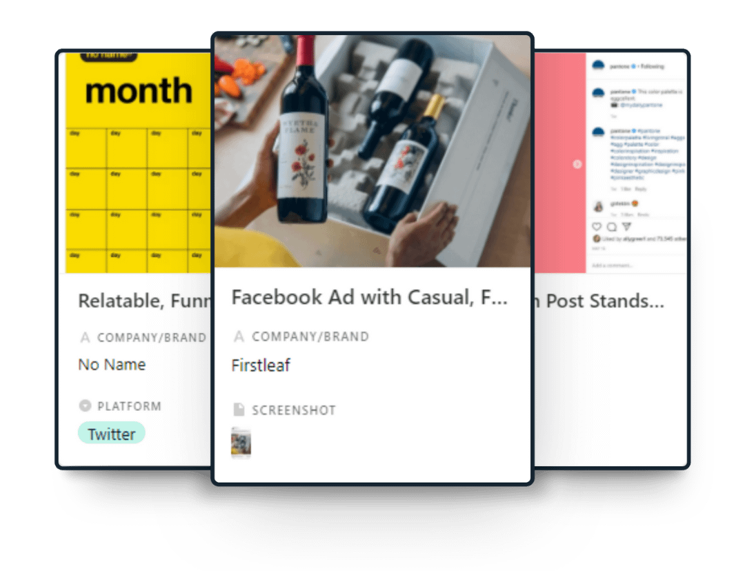
21. Firstleaf – Casual, Compelling Copy
Do your ads sound stilted and salesy or do they sound like your brand?
Firstleaf approaches ad copy with a casual voice, which is fitting for a trendy, millennial brand.

What do we like about this ad:
- Creative: Humans trust other humans, remember? By including a human element in their product shot, Firstleaf is triggering that response in prospects viewing the ad.
- Copy: Great, casual copy referencing a line from a popular comedy film makes this ad feel less sales-y and more conversational – all while operating within the classic Problem, Agitate, Solve framework.
22. Kodiak Cakes – Leveraging Testimonials in Shop Now Ads
Testimonials are a powerful tool for selling for a straightforward reason: people trust other people’s recommendations.
See how Kodiak Cakes uses a testimonial in their ad copy 👇

What this ad does well:
- Creative: The carousel gives the feel of shopping in an online catalog, and the photos themselves are aligned with the brand’s lifestyle positioning. Kodiak Cakes’ product isn’t pancake mix, it’s the idea of outdoor adventure.
- Copy: Using a glowing testimonial as the ad copy is an effective tactic.
23. Calm – Delivering Value with Their Ads
Can you create an ad that adds value to your prospects’ timelines…even if they don’t buy anything?
Yes, because value can mean different things – education, entertainment, or, in the case of Calm, mental wellness and self-care.

Take a 20-second meditation break and watch the full ad here.
What we like about this ad:
- Creative: Apart from being colorful and eye-catching, this video ad does well because it showcases a product feature right in the timeline, allowing prospects to experience the app without having to download it.
- Copy: While the primary text copy is strong and addresses the pain point, the important copy in this ad is the video text. It guides viewers through a simple breathing exercise, providing value before asking for a sale with the CTA.
24. Coverage Book – Illustrating Product Benefits From a New Angle
Telling the same story (Before-After-Bridge) from a new angle can make it feel fresh again.
See how Coverage Book did it.
What this ad does well:
- Positioning: The copy tells a story that positions the product’s benefit for a better user experience. This is a great tactic for B2B brands to use.
25. Carta – Reaching Ideal Users
How can you target your ideal user more effectively?
Get specific. Let them know that this ad is meant for them like Carta does in this example.

What we like about this ad:
- Copy: It’s clear to any CEOs reading this ad that the product has been designed with their unique challenges in mind. By using exact match title and role in the copy, Carta drills down to reach their ideal user on a more personal level.
26. Tealium: Getting Specific with Account-based Marketing
Account-based marketing (ABM) is all about turning your dream clients into your actual clients.
Check out how Tealium tailors every part of its ads to stand out in the feeds of its target accounts.

What these ads do well:
- Copy: Tealium calls out their target accounts (in this example, Nationwide and Capital One) in three different places: the ad copy, the image text, and the title (the text in the gray box at the bottom, with the URL). Ad customization is the name of the game.
- Creative: While the bright colors are likely to stand out in the feed, it’s the targeted copy stands even taller. “Nationwide” and “Capital One” are highlighted, drawing the eye immediately before the user reads the full copy.
27. Optimizely – Making the CTA the Focus
Grabbing your prospect’s attention is a task that you must complete in 2 seconds or less. And when conversions is the name of the game, that means that the prospect’s attention should be guided towards your value proposition and call-to-action (CTA).
Optimizely uses a pop of bright color in their ad creative to draw the eye down to the CTA button.

What this ad does well:
- Creative: The minimalist design here works toward drawing your eye down to the CTA button. The black background doesn’t distract, but instead allows the yellow accent color to pop, drawing the eye down to the CTA. The image text is easy to read and clean but still eye-catching with its clever design.
28. HubSpot – Eye-Catching Animations
When you’re trying to stop thumbs, your ad creative is one of your most powerful tools. You want something that helps stand out in your prospects’ overcrowded feeds.
HubSpot knows that a little bit of movement is often enough to catch and hold users’ attention.

(View the full animation here)
What we like about this ad:
- Creative: The animations are functional: the white space makes the image text easier to read. In addition, the animations enhance the image without detracting from the human element, which performs well.
- Copy: Both the ad and image copy are concise and targeted, quickly illustrating value.
29. Incogmeato – Turning Up the Heat with a Poll
X and LinkedIn’s native poll features are excellent tools to drive engagement and that extends to sponsored posts featuring polls as well.
Check out how plant-based food brand Incogmeato did it below.

What we like about this ad:
- Creative: Adding a graphic to the poll is what took it to the next level. The image copy draws the eye first and calls for interaction in a playful, slightly antagonistic way.
- Copy: The borderline-inflammatory messaging encourages dialogue without being offensive.
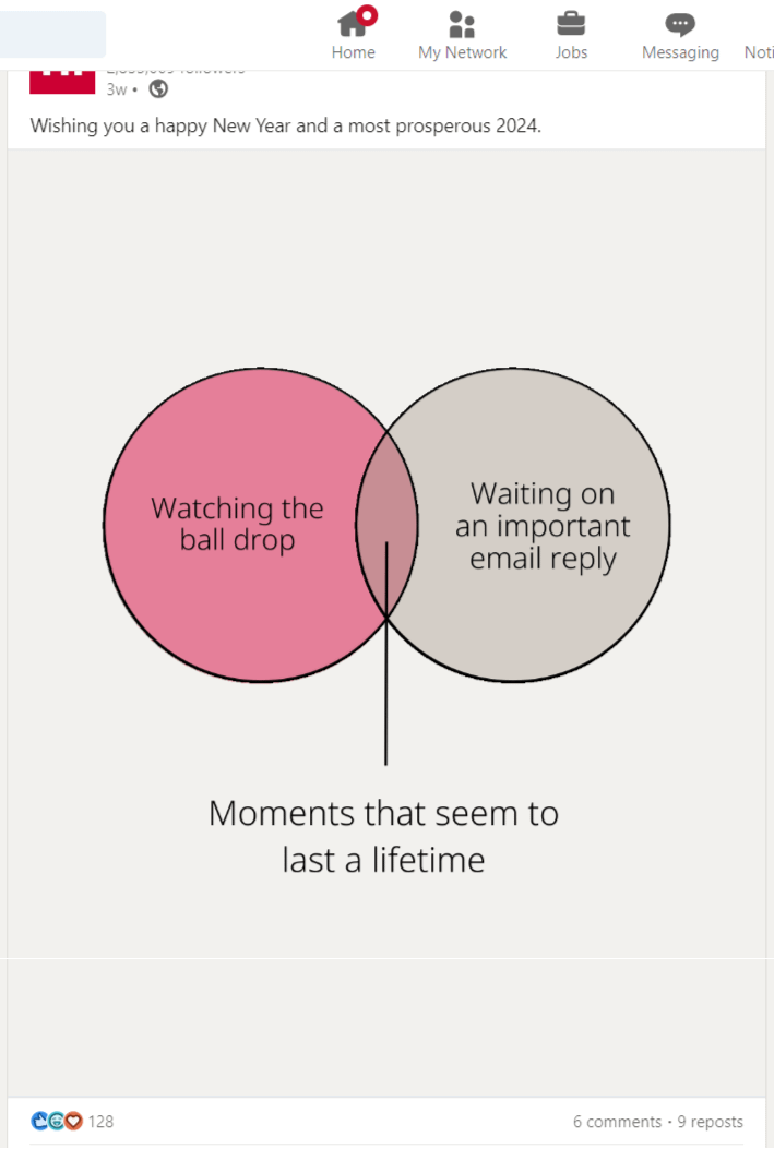
30. Recess – Retargeting with Venn Diagrams
While you don’t have much time to get your point across in an ad (remember, 2 seconds or less), you can use visuals to communicate faster.
There are many ways to achieve this. Mocktail brand Recess used a Venn diagram in this retargeting ad, which struck us as something new and fresh.

What this ad does well:
- Creative: Overall, this graphic is very aesthetically pleasing and on-brand — a soothing color palette and casual lowercase typography. The standout feature, though, is the use of the Venn diagram. It works as a kind of visual shorthand to communicate their messaging quickly and represents a successful case of visual synthesis.
31. MainStreet – Breaking the Fourth Wall
Sometimes, the best way to break up the monotony and stand out in a feed is to acknowledge the obvious: hey, this is an ad and we’re talking to you!
Breaking the fourth wall is unexpected and refreshing, as proven by the tax credit platform MainStreet in this promoted X post.

What this ad does well:
- Copy: Both the image text and the primary copy grab attention immediately and communicate the value prop well. More impressive, though, is how the copy also works as a lead qualifier. The ad simply asks the user not to click the ad if they don’t meet the criteria, which feels engaging and compelling.
Content Ideas for Social Media: Who to Follow
32. Aldi UK on Instagram – Appealing Visuals
Aldi is an international grocery store chain with over 10,000 locations across Europe, Australia, China, and the US.
They’re best known for their no-frills stores and low prices, but their Instagram is also poppin’.
Follow if you like:
- Never-ending feed: Aldi UK’s IG page is a masterful example of a seamless grid. Scrolling through their page is a visual buffet that feels like one cohesive, never-ending image.
- Link in bio: The brand pairs its mouth-watering images with breezy, casual copy that gives you just enough of the recipe to want to click the link in the bio, read, and shop the ingredients.

33. Arm on LinkedIn – Balanced feed and aesthetic B2B
Arm is a software company that designs and licenses chips and sensors. Their LinkedIn account is regularly updated and a great example of B2B social done right.
Follow if you like:
- Balanced feed: Arm posts a good mix of product-focused content and behind-the-scenes posts to their LinkedIn page.
- Modern B2B Aesthetics: Arm’s feed is full of posts with cool, colorful graphics that make the subject matter feel less abstract.

34. HubSpot on Facebook – Consistent branding and educative content
Most marketers are familiar with HubSpot. Their status as experts on inbound marketing is evident, and it also shows in their social media accounts. While they crush it across all channels, we particularly recommend checking out their Facebook Page.
Follow if you like:
- Consistent branding: Both HubSpot’s paid and organic content are beautifully and consistently branded for a flawless, unified, and aesthetically pleasing brand experience.
- Educational content done well: Providing value and resources at no cost to your customers is how to build strong customer relationships.

35. Later on Instagram – Organic advertising and tips for socials
Social media planning and scheduling app by day and industry experts by…well, also day, Later is a well-known player in the social media scene. It should come as no surprise to find them on this list.
Follow if you like:
- Organic advertising: Later’s Instagram content is bright, colorful, fun, and makes you want to start using Later if you don’t already. It’s a great example of how you can advertise your product in organic and owned media without coming across as pushy and sales-y.
- Educational content: As industry experts, Later uses their platform to educate followers about all things social media – not just their product features. Their account is a useful resource if you’re looking to learn about social media news, trends, or tools.

36. Pantone on Instagram – User-generated content and color gradient grid
The Pantone Color Matching System is used across most industries as the standard for color classification and reproduction.
On Instagram, though, it’s easy to forget that Pantone is a B2B company since their branding is just so aesthetic.
Follow if you like:
- State-of-the-art user-generated content: UGC is a valuable asset in the content calendar of any brand, but for Pantone, it is the content calendar. You’ll notice that their feed is consistent in terms of quality despite being aggregated from a variety of creators.
- Color gradient grid: We love a good grid and Pantone’s color gradient grid is on point. And since color inspiration is their whole deal, it’s also 100% on-brand.

37. Slack on X – Community management
If your company functions anything like ours does, then you’re likely already familiar with Slack, especially in the era of globally distributed teams.
But you might not be familiar with their X account…and you should be.
Follow if you like:
- Community management done right: Slack’s masterful community management is anchored in its responsiveness and the use of voice. The funny, casual vibe that comes through in their posts is the same tone they use when responding to customer questions, concerns, and replies.

38. Square on Instagram – Customer stories and consistent branding
Square is a merchant services company based out of Silicon Valley. You’ve probably swiped your card with one of their card readers at your local coffee shop! On Instagram, that’s exactly who they’ve chosen to highlight – a strategy that other B2B brands in similar industries can learn from.
Follow if you like:
- Customer stories: Customer success stories are by extension your brand’s success stories. Square leverages the power of these testimonials regularly, turning its Instagram page into a mini library of case studies.
- Consistent branding: Clean, minimal, black-and-white. Square’s posts are consistent and easily recognizable in the feed.

39. Steak-Umm on X – Brand voice
Snarky, witty commentary from a food brand? We’ve seen it before, but not quite like this. Wendy’s social media manager crawled so that Steak-Umm’s social media manager (AKA Nathan Allebach) could run – and also dance on TikTok with a Steak-Umm box on his head. X is where things took off for Steak-Umm, though.
Follow if you like:
- Brand voice virtuosos: Human, witty, self-aware, and slightly absurd, Steak-Umm’s X voice is a persona unto itself. While it doesn’t have much to do with frozen steak, that’s kind of the point, as evidenced by the brand’s viral fame.

40. Tim Gray on Instagram – For Creative Inspiration
Tim Gray is a freelance motion graphics designer and co-founder of Breakout Clips, a video ad template service. His Instagram account features a lot of the animations he designs for the site.
Follow if you like:
- Creative inspiration: Tim Gray’s unique creative style is a great source of inspiration for how to use motion graphics in your future content. You can save examples to a dedicated design swipe file to share with your design team, or you can get the design straight from Breakout Clips – all of Tim’s designs are available for download through their subscription service.

41. Van Leeuwen Ice Cream on Instagram – Colorful Feed
Founded in NYC, Van Leeuwen is an artisan ice cream manufacturer with an IG presence that is just as delicious as their product.
Follow if you like:
- Colorful feed: While most of their ice cream comes in yummy tones of brown, pink, and cream (you know, normal colors for ice cream that’s not full of food coloring), Van Leeuwen’s posts always incorporate fun pops of color – either in the background or the ice cream cartons themselves.
- Amateur and professional photography: Van Leeuwen manages their IG feed with a great mix of stunning, professional product shots and more casual, “iPhone photography” of relatable moments or just fans enjoying their ice cream. The result is both balanced and aesthetic.

42. Trainual on LinkedIn – Episodic Content
Trainual provides companies with a central hub for onboarding, training, and SOP management. Their LinkedIn page acts as its training manual of sorts, full of helpful advice, knowledge, and industry news.
Follow if you like:
- Episodic content: Serial content is great for a consistent feed, and also for capturing and holding users’ interest week after week. Alongside social-first content like their company culture series, Trainual repurposes clips from their podcast “Process Makes Perfect”, filling their page with consistently engaging episodic content that works for the platform.

43. Gong on LinkedIn – Engaging Text and Color Discipline
Another B2B SaaS brand with a great LinkedIn presence, Gong is a sales insights and analytics tool for remote teams.
Follow if you like:
- Engaging text posts: Looking at Gong’s LinkedIn page, you’ll see it’s not flooded with pretty graphics or fun videos. It’s mostly… text posts. Why does it work? A few reasons. Their consistent format — all caps headline followed by a double-spaced exposition — is easy to read and digest. Their straightforward, first-person voice feels casual as if you’re talking to a friend. And finally, they consistently provide value. The majority of their posts are full of punchy, actionable advice for sales professionals.
- Color discipline: Gong sticks to its color code in almost all its communications, except memes. We love a company that maintains a particular tone.

44. Seismic on LinkedIn – User-focused Content
Seismic provides businesses with customer service and sales training solutions. Their LinkedIn page features their customers, team, and tons of helpful info for platform users.
Follow if you like:
- User-first focus: Seismic’s LinkedIn is full of great info for users, made with those users in mind. Their article and webinar teasers are easy to read, the main point of any post is clear before the fold/’see more’ tab (LinkedIn truncates text at 140 characters), and they highlight their customers as stars in a regular series.
- Consistent branding: The color consistency is aesthetically pleasing and cohesive. It’s also nice to see a brand that uses lots of pics and illustrations instead of stock photos, which feels more personal and authentic.
45. Dooly – For Memes and Thought Leadership
Brands that know their audience well are hitting it right. Dooly’s LinkedIn page is all shades of fun and life.
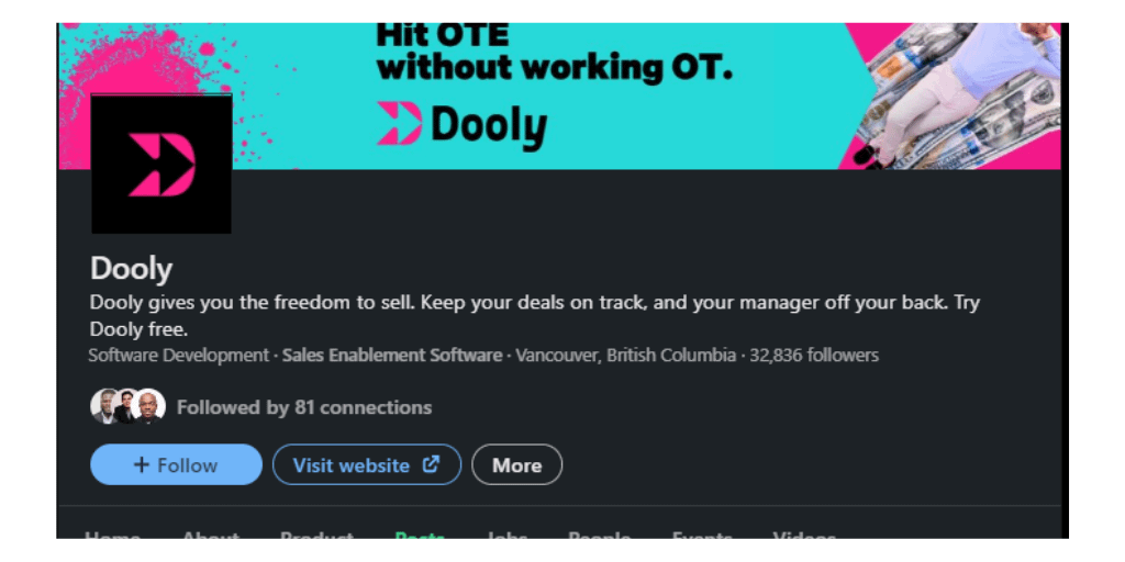
Follow if you like:
- Relatability: Dooly meets our eye with something different for every significant scroll we make. From engaging memes to attention-grabbing videos, you can scroll to the bottom page if you have the whole day.
Bonus: Robert Half – For Variety and Experimentation
The international talent solutions firm Robert Half does an excellent job on LinkedIn (where its primary audience operates, very obviously).
Their constant experimentation with Q&As, “shower thoughts” like posts, and homegrown memes is a healthy display of their creativity range, also serving as proof that B2B and HR don’t have to be boring (not they should).
Follow if you like:
- Creativity: From homegrown memes to short video cuts, Robert Half shows the rest how it’s done. You might not like a post, but you won’t get bored!
- Experimentation: Breaking away from a stiff, sanitized corporate voice is very hard, but Robert Half does a good job at it. The result: An approachable brand that makes people want to engage.
[Bonus]: Organize your creative process with our social media swipe file template
Use our Social Media Swipe File Template to build a gallery of good ideas and social media examples. To get you started, we’ve filled it with some of our favorite examples of great social posts — both paid and organic.
Looking for More Social Media Inspiration?
If you’re interested in more examples of great social media content, check out the following resources:
- Best B2B Social Media Campaigns to Inspire Your Own in 2023.
- 23 Best B2B Social Media Marketing Tips & Tactics.
- How to Use the Facebook Ad Library to Your Competitive Advantage.
Don’t forget to read our post about building a social media swipe file and grab our free template!
where do you stand?